GEOMETRIC PSYCHOLOGY IN VISUAL MERCHANDISING
From art to architecture, film to fashion, geometry is a staple in the creative industries. So, when it comes to creating innovative retail spaces using geometric psychology can make an impact in how the consumer experiences the store.
When it comes to geometry in spatial design, the main geometric shapes used in spatial design for retail shapes are the circle, square, hexagon and rectangle. When used either together or as a stand-alone feature, these shapes create endless possibilities to obtain the sense of harmony for the store design. Symmetry, modularity and repetition can also be implemented to stimulate a variety of sensations and sentiments for consumers. In fact, geometric shapes are a fantastic visual merchandising tool as consumers are familiar with their forms.
How can basic shapes be used in store design? How can geometry be used as an effective visual merchandising tool? How can a store enhance its brand identity via seemingly simple polygons?
Take a look at these examples!
The circle
Perfection & progression
The circle is considered to be the “mother” of all of geometric shapes and as such is associated with the idea of perfection and continuous movement. Its seemingly endless curved perimeter creates an idea of velocity which can be used to convey a message of flux and flow.
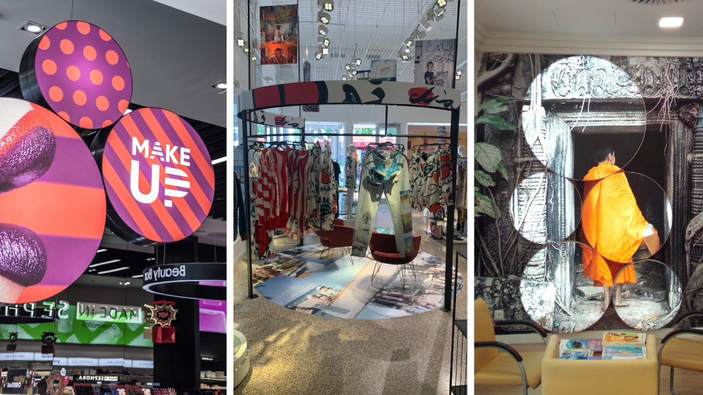
Sephora breaks with the traditional beauty décor with circular lightboxes used in creative compositions. In their Miami store, Desigual features a circular in-store pop-up to highlight its collaboration with designer, Esteban Cortazar. While El Corte Inglés Viajes uses multiple circular lightboxes of varying sizes to create a singular visual that makes an impact.
The square
Solid & strong
The square, a parallelogram, is associated with strength, protection and trajectory. This sets the tone for it be used in very ordered design concepts. Combining a square based design with varying colours or textures creates a strong in-store statement.
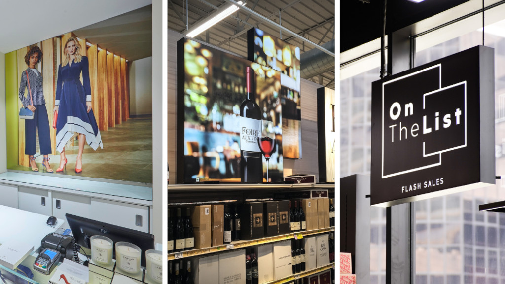
In London affordable luxury brand, LK Bennet, maximises the space behind the till with a sharp, square visual. Carrefour makes a strong impression using square lightboxes to highlight its wine cellar in its Villiers-en-Bièrre. OnTheList, the omni-channel shopping phenomena in Southeast Asia, uses square suspended signage to enhance brand awareness.
The rectangle
Established & effective
The rectangle offers solid design options that are different to the square due to its elongated sides. It is the most common geometric shape encountered in design and its familiar form represents honesty, solidity and stability. The combination of different sized rectangles creates interest and engagement.
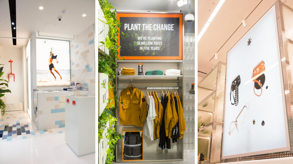
Light, bright and rectangular describes the Spitalfields store of designer swimwear brand, Orlebar Brown. Iconic brand, Timberland integrates rectangular signage into its store fixtures for a seamless VM display in their London store. Meanwhile luxury brand, Off-White, uses rectangular signage to create ambiance amongst their handbags and accessories.
The hexagon
Balance & belief
This seemingly simple shape can be found in everyday life. From the cells of a beehive to the Giant’s Causeway, from nots and bolts to the humble pencil, this six-sided shape shows up in time and time again. For store design it allows a design that conveniently stands between a polygon and a circle thanks to its degree of roundness. It’s a powerful and fascinating shape.
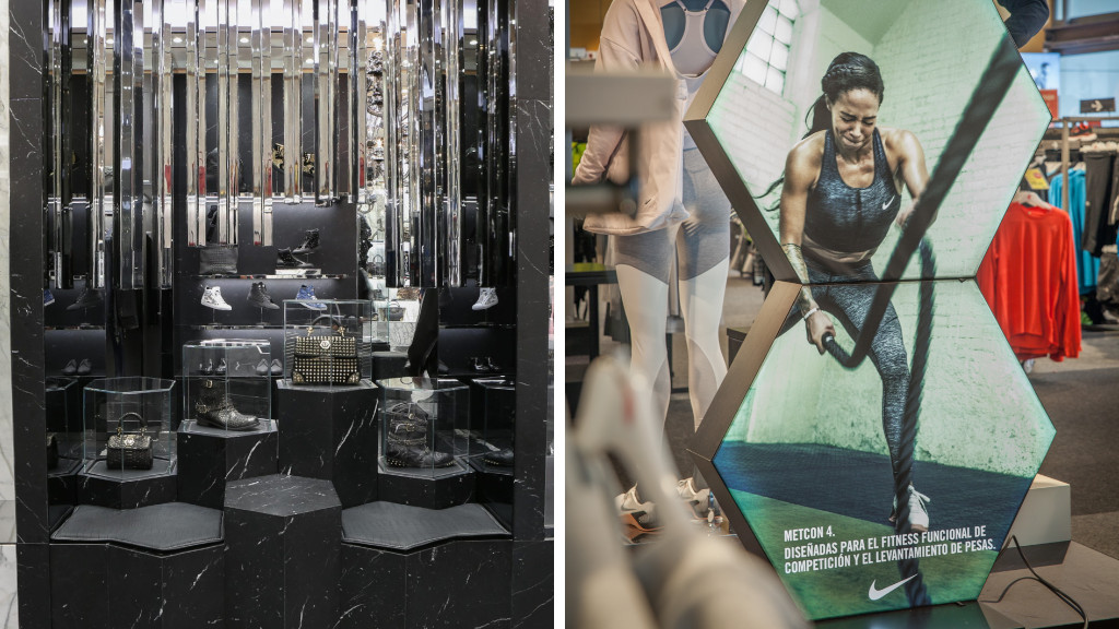
German fashion brand, Philipp Plein, is ubiquitous with the hexagon. Inspired by the brand’s logo, the hexagon is incorporated seamlessly into its store design. Spanish sports superstore, Forum, uses the hexagon to evoke balance for a fascinating VM display.
Rethinking the way we shop
We are experts in developing new strategies and innovative store formats to boost in-store engagement.


