2022 COLOUR TRENDS
In branding, colour psychology focuses on how colours affect brand perception and consumer behaviour. Choosing the right shade can make the difference between standing out from competitors or going completely unnoticed.
In fact, studies have shown that colours can influence our emotional state. This becomes even more important given that a customer’s impression of a product is formed in the first 90 seconds of interaction and 62% – 90% of their opinion is based on the physical appearance of the product. So, colour choice when it comes to product and how it’s displayed in-store is vital.
Use our guide to the colour trends of 2022 to ensure that your store design and in-store displays hit the mark this year.
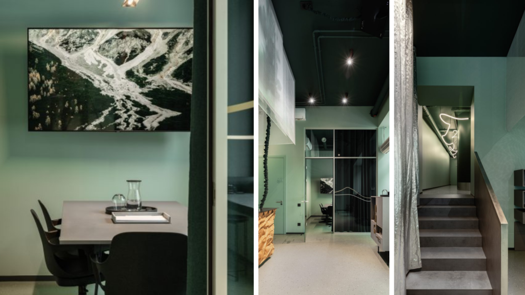
Gray Green
Earthy tones
Companies of calibre such as Benjamin Moore, PPG and Sherwin-Williams all agree that the colour of the year is Gray Green. It’s the new version of the neutral and cold tones that have dominated the colour trends in recent years. This year it’s a subtle, but colourful alternative. Gray Green is perfect to combine in-store with earthy tones to achieve an organic look&feel. The tone creates an atmosphere of harmony and nature to bring about a sense of balance.
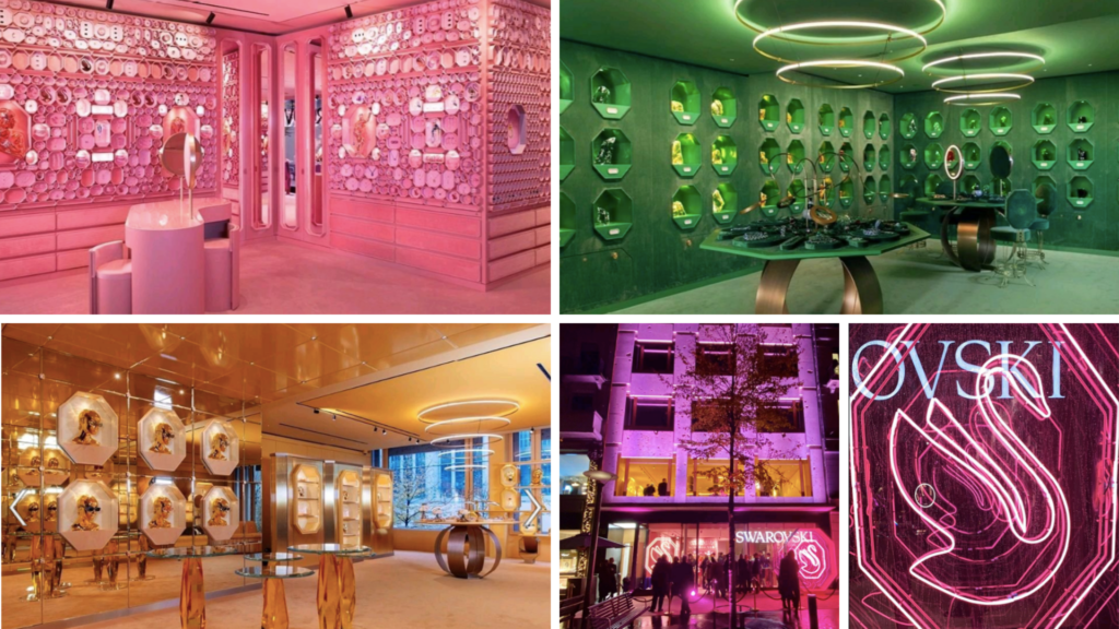
Neon
Vibrant Colors
Both the Big Four Fashion Weeks (Paris, Milan, New York, and London) and the promising Danish catwalk have all had some in common. Spontaneity represented by an explosion of neon colours! The trend of neon colours underscores the emerging need for creative expression in a post-pandemic context. With such a vibrant palette it’s hard to choose just one tones. Our choice of neon includes colours such as Bubble Gum or Coral Rose. Will you dare to neon?
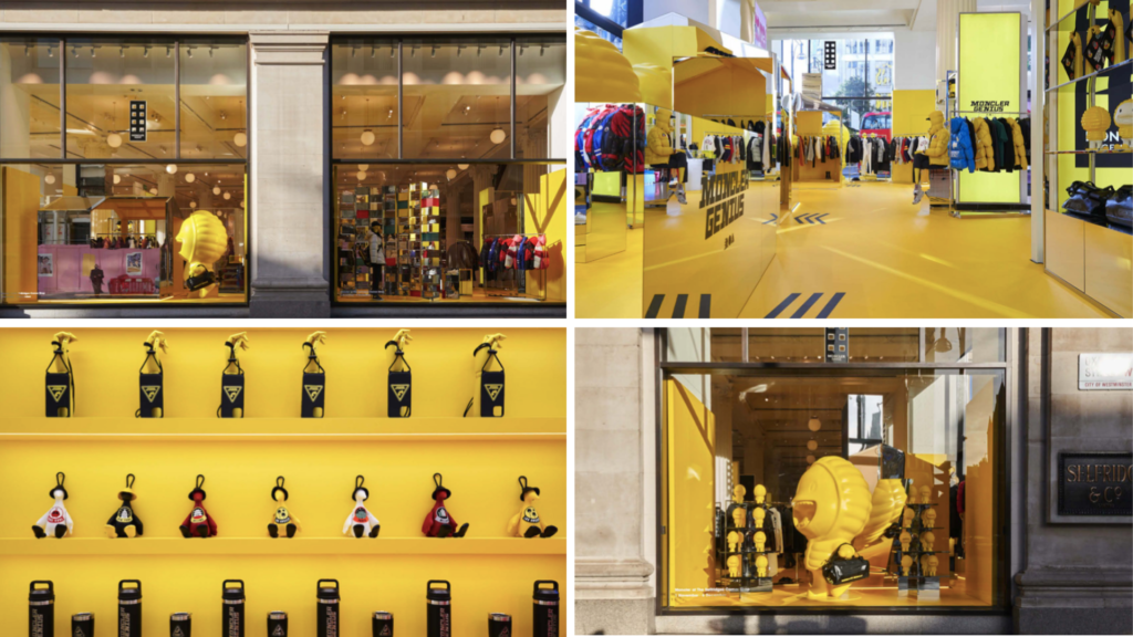
Babouche
Citrus
Citrus tones, with a shout out to yellow, finally abandon their negative connotations to position themselves as one of this year’s favourites. And it’s all thanks to yellow’s energising power. Babouche (no.223) by Farrow & Ball is the front-runner. But be careful! Babouche can be overwhelming in large quantities, so it’s best combined with classic cream tones ensuring that the featured space or product really stands out. It’s a joy to behold.
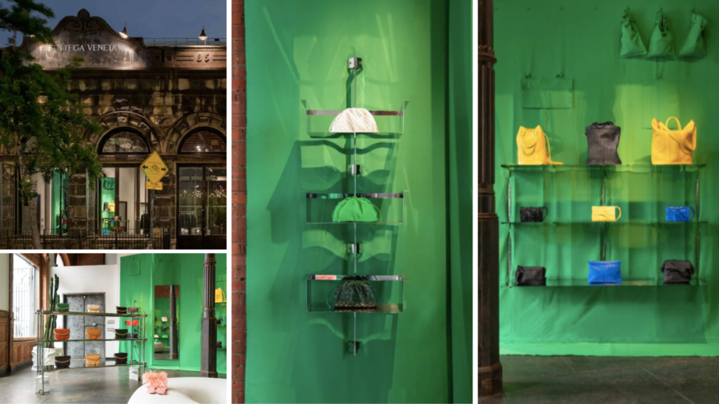
Chartreuse
Greens
Green is a colour for all seasons of the upcoming year according to haute couture designers such as Missoni and Brandon Maxwell. Looking for a safe bet that will get you through the year? Olive Green or October Mist are your tones. More avant-garde options include Quetzal, Green Bottega or, our favourite, Chartreuse. So why is green so popular? Simple, green represents hope and renewal and the possibility of prosperity. A welcomed sentiment 2 years into the pandemic.
Art & Craft
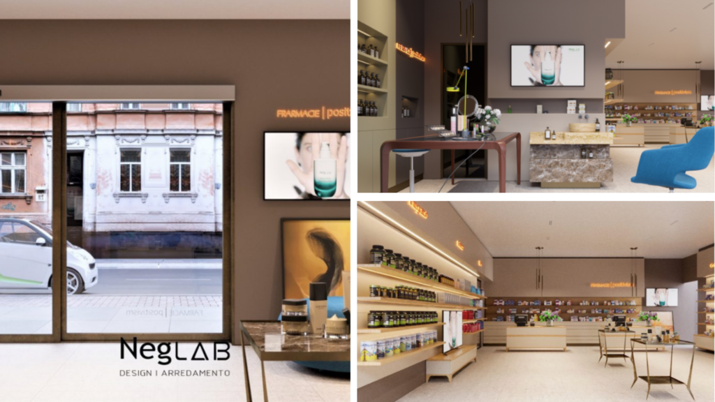
Neutral browns
Dunn Edwards follows the line of the gray green, in terms of an approach to nature. Merging the stability and calm that this color range evokes, with the style of the 70s, brown shades are already a must for this winter 2022. It is only needed to go through social media, shops, and streets to identify the dimension of this trend.
JOIN US TO PRINT YOUR COLOUR CAMPAIGNS
Thanks to cutting-edge printing machinery, we are digital printing specialists at colour treatment service.


